Poster Design
Here is a poster I designed for class. The goal was to design a poster the "represents who you are." I will post my description below.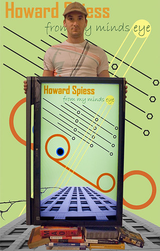
As I was brainstorming this project, a multitude of lofty ideas came and went. In the end, when I chose to move forward on this concept, I knew that I wanted the design portion of it to be simple. I have placed emphasis on line and geometric shape in my design.
Again, I incorporated an abstract eye into the design to represent my personal world view of design.
The line coming off of the bottom of the eye is my line of sight, which then connects with my simple circle to represent the earth, the way I see it. The consistency of hue between the eye, line of sight, and earth was not a coincidence, but is there to represent their connection and how closely they all relate to one another.
The black lines and hexagons represent future visions and design solutions. As you can see there are a multitude there, and the idea was to create the feeling that they were infinite. By placing them together in a way that creates an implied organic star field image, the viewer may understand that there is more beyond what they see on the surface, similar to how we perceive the stars in the night sky.
The yellow circle represents inspiration and is purposely designed to imply the shape of the sun with its rays coming off and crossing my line of sight. Through the use of line it draws the viewers eye from the top right of the image, to the bottom left, which is opposite of how most people naturally view a design. I did this because it pulls the viewers eye back in, instead of letting them fall off of the side of the design as they follow all of the other lines.
Lastly, the incorporation of the building image is a picture I had taken while on a trip to LA. For some reason the pictures speaks to me about the modern world and connects with my logical real world existence. For me it represents structure and a solid base in an otherwise chaotic world. This structure is provided by self and is something we all create in order to make sense of the world around us; the core of our ideas.
Now, I wanted this poster to be different and go beyond a solely graphic design. In an effort to represent as much of myself as possible, I included myself, books, and the TV that holds the design. The books are now at the base and are holding up everything else, the way our intelligence and education carries us through our professional lives. The TV that holds the design was my fun way to incorporate technology into the piece, which represents my interest in science and technology. And myself holding it all up was my sneaky way of getting my mug shot into the design and represent its creator. The shirt I am wearing actually inspired my use of color and line in the design, and me wearing it tied myself to this particular project.
I planned to key out the background from the initiation of this project without really knowing what I would place there. After some trial and error with solid hues, gradients, photographs, and more graphic design, I plugged in the design that is on the TV and the result made me quite happy. This repetition really tied the design together as a whole. After messing with scale a little, I was able to create the impression that the building extended from the background and into the TV. All of this was initially unplanned, but an exciting discovery.
![]()

2 comments:
That's awesome! Well done.
Only someone like me can truly appreciate the sony lcd that frames your logo! It's detailed in a very simplistic way. I like. I hope the hard work paid off!
Post a Comment