Wednesday, March 25, 2009

First Draft: Abstract Text Cover

Another homework assignment. Again, I find myself going the simple and clean route. I am not sure if this is some internal aesthetic choice, or if it is my personal limitations limiting me to this style. I am satisfied with the design thus far. This is the first draft, created over the last few hours.

Abstract Text Cover

Tuesday, March 24, 2009

Political Marketing

Tonight, President Obama fills us in on his plan for economic recovery. This is obviously not going to be a bipartisan entry. The Fairness Doctrine has not been put in place yet *wink*. Anything in quotes here is not direct, but a paraphrase as I listen in. Let see what he has to say:

- Right off the bat he deflects responsibility and is sure to make clear it was not him that put us in this financial crisis. True, but not the talk of a leader. This is not about deflecting responsibility, but offering solutions.

- "Look beyond our own short term interests, to the wider needs of all." Yikes. This sounds nice, but is dangerous rhetoric and a very slippery slope. Mr. President, I have a hard time as a tax payer bailing out those who got into mortgages that they could not afford, while I am stuck in a house that I could not break even on if I tried. It is a house I can afford, and I make my payments on time. Where is my cap reduction? If I had bought a house that I could not afford then I would qualify for government assistance, "for the greater good." This sir, is unfair. For responsibility I receive nothing, but for irresponsibility you receive bailouts. Perhaps if the likes of Barney Frank had not forced Fannie and Freddie to hand out loans to people who could not afford them, we would not have all of these bad assets and much of the housing crisis may have been avoided.

- Who the heck is Chuck Todd? "What should the public be sacrificing?" Come on Chuck. Lob that one in there so the President can jump in and say that they are already sacrificing. What a bald faced setup... this is reporting? The guy has one question and this was his choice.

- Cap and trade is a government scam, with them as the auctioneers. The way it is structured it will only pass down costs to consumers via higher energy prices. I fully support reduced carbon emissions, but the idea that you can force this through cap and trade only pushes cost down to the consumer. You may get a tax credit, but you will pay for it in higher energy costs later.

- Some good questioning by the gentleman in the front row about the deficit. I did not catch his name. Calling out Obama's rhetoric of cutting the deficit in half. The fact is, he has already almost doubled it and then after 6 years the budget deficit continues to GROW, not shrink. Obama talks about the long term, but in the long term the Obama deficit only gets bigger and bigger, with only a SHORT TERM reduction.

- Nice work on the Mexico deflection. I can already see the headlines tomorrow. Obama Tackles Cross Border Violence. I agree that the Mexican drug cartel problem is extremely dangerous, with ever increasing bloodshed, but its acknowledgment here feels forced. With the amount of bloodshed in Pakistan and Afghanistan daily, where we are currently engaged and focused militarily,this seems weird.

- Really pushing health care reform as the nexus of the economic problems. This will help his public opinion polls on the socialization of medicine.

- Major Garrett. You cheeky bastard. You never know what comment will come out of him. "What do you think when center-left and socialist European countries say no to more stimulus and overreaching spending?" lol. *jab*

- Wow, "it is not going to cripple them, they will still be well to do." This anti-rich stance is dangerous. His whole BS line that he thinks that the bus driver who earns $50,000 a year should have the same deduction as the wealthy businessman is a shameless downplay on this charitable contribution deduction program. The fact is, the rich are doing the large majority of the charitable contributions and with a reduced deduction their contributions will become less, and the CHARITIES WILL SUFFER. It is not that the rich will be less rich, but that they will adjust their contributions down in order for them to maintain their quality of life and still make charitable contributions. This will have an extremely negative effect on charities of all kinds. It is a blind tax grab to fulfill a bloated budget.

- The stem cell talk has thrown him off. He certainly is having trouble eloquently spinning positive rhetoric versus ethics on this one.

OK, I may get beat up here, but these are my thoughts as the press conference moved along. Interesting choice in reporters, eh? No WSJ, NY Times? No financial networks or publications? Thanks Fox, for pointing this out!

Till next time.

Monday, March 23, 2009

180 Marketing


Here is a new component that is sent as a HTML email.

Saturday, March 21, 2009

I got your attention!

Now that I have sufficiently got your attention I will blog more. I know, my email was less than subtle, but oh well. I was thinking of vlogging (sp?). Interested?

Sunday, March 08, 2009

Poster Design

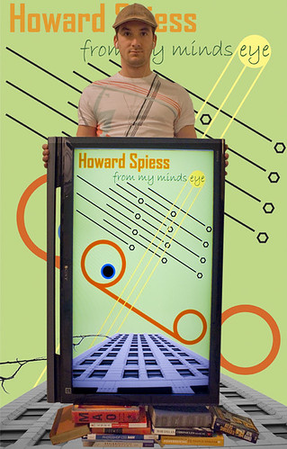
Here is a poster I designed for class. The goal was to design a poster the "represents who you are." I will post my description below.

Design Project: Personal Poster

As I was brainstorming this project, a multitude of lofty ideas came and went. In the end, when I chose to move forward on this concept, I knew that I wanted the design portion of it to be simple. I have placed emphasis on line and geometric shape in my design.

Again, I incorporated an abstract eye into the design to represent my personal world view of design.
The line coming off of the bottom of the eye is my line of sight, which then connects with my simple circle to represent the earth, the way I see it. The consistency of hue between the eye, line of sight, and earth was not a coincidence, but is there to represent their connection and how closely they all relate to one another.

The black lines and hexagons represent future visions and design solutions. As you can see there are a multitude there, and the idea was to create the feeling that they were infinite. By placing them together in a way that creates an implied organic star field image, the viewer may understand that there is more beyond what they see on the surface, similar to how we perceive the stars in the night sky.

The yellow circle represents inspiration and is purposely designed to imply the shape of the sun with its rays coming off and crossing my line of sight. Through the use of line it draws the viewers eye from the top right of the image, to the bottom left, which is opposite of how most people naturally view a design. I did this because it pulls the viewers eye back in, instead of letting them fall off of the side of the design as they follow all of the other lines.

Lastly, the incorporation of the building image is a picture I had taken while on a trip to LA. For some reason the pictures speaks to me about the modern world and connects with my logical real world existence. For me it represents structure and a solid base in an otherwise chaotic world. This structure is provided by self and is something we all create in order to make sense of the world around us; the core of our ideas.

Now, I wanted this poster to be different and go beyond a solely graphic design. In an effort to represent as much of myself as possible, I included myself, books, and the TV that holds the design. The books are now at the base and are holding up everything else, the way our intelligence and education carries us through our professional lives. The TV that holds the design was my fun way to incorporate technology into the piece, which represents my interest in science and technology. And myself holding it all up was my sneaky way of getting my mug shot into the design and represent its creator. The shirt I am wearing actually inspired my use of color and line in the design, and me wearing it tied myself to this particular project.

I planned to key out the background from the initiation of this project without really knowing what I would place there. After some trial and error with solid hues, gradients, photographs, and more graphic design, I plugged in the design that is on the TV and the result made me quite happy. This repetition really tied the design together as a whole. After messing with scale a little, I was able to create the impression that the building extended from the background and into the TV. All of this was initially unplanned, but an exciting discovery.

Wednesday, March 04, 2009

Personal Logo

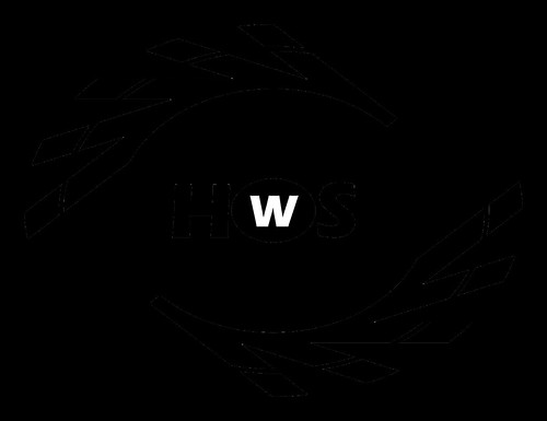
Fun assignment in Visual Communication Theory. Design a Personal Logo in black and white. Here is my creation:

Personal Logo

Simple, yet functional. I was looking to create an abstract, implied eye. In the end, it was less abstract than I had hoped, but I was happy with the implied organic shape. Created in Adobe Illustrator.

Camera RAW

Well, I did it. I have made the plunge into RAW. It is definitely a whole new world and given that a week ago I knew nothing about it, I am feeling much better about the prospects. I picked up a great book that is teaching me the ins and outs of Adobe CS3 Camera Raw editing. I have a long way to go, but have burned about half way through the text already. The amount of control is staggering and when coupled with Photoshop, it really allows for an incredible amount of post production control.

That being said, I quickly found out that you still have to take great shots with the camera to get great outcomes. RAW does not provide you the ability to transform a bad picture into a good one. One part I really like about it is the ability to adjust the exposure during the post production. Again, shooting with a good low light lens is superior, but I have found that I can really brighten up some of my low light shots after the fact by adjusting the exposure in Camera Raw.

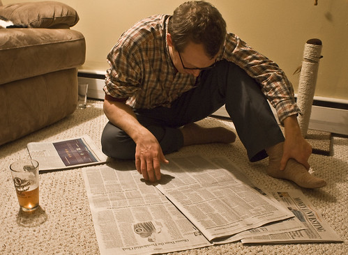
Anyway, I am very excited to get out and shoot some more. I have been playing around with F-stops and shutter speeds with mixed results. The ability of a good lens cannot be understated, and I have come to the conclusion that the stock lens that my camera arrived with will need to be replaced/substituted with a fancier one. Maybe before Hawaii. Below is a nugget from Ben's visit. I post-produced it in Camera Raw and was pretty happy with the color output.

Ben + WSJ + Beer

I did a lot of color altering here. As a reference, the wall in the background is actually yellow. The photo is soft, but again I need a better lens for low light shooting.